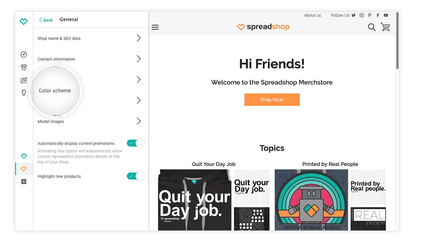
Check out your new checkout! We’ve just introduced an upgrade that seamlessly matches your checkout page to the color scheme of your Shop. Keep your look and feel consistent for your customers’ entire journey: from your start page to the shopping cart.
With this fresh checkout area update, your shopping cart is now automatically matched to the design and color scheme of your shop. You can adjust these settings at any time under: General > Color scheme.
In addition, your logo from your Shop header will be displayed in the checkout. (Psst, if you don’t have a Shop logo yet, now is the perfect time to upload one. Go to: Page Options > Header > Logo.)

The new checkout will also display your Shop imprint and any additional information you added in the settings under: General > Imprint.
Curious? Go ahead and try it out now! Just add an item to your shopping cart to see your new checkout for yourself.
Time-consuming HTML and CSS adjustments in the Checkout Settings are now a thing of the past. We have removed the Checkout Settings item from your advanced settings accordingly.
However, if your color scheme does not meet the current accessibility standards, we will automatically set a color scheme for the checkout that meets the conditions. Test for yourself whether your selected colors can be displayed properly.
With the new checkout, your shop brand is in the spotlight. Are you happy with the new look? Is there anything missing? Let us know in the comments.
Hi
When will this be rolled out to Australian based stores? The options are not currently showing up in my General options.
Also, I have my store embedded into my wordpress site. Can you please tell where to change the setting (or html) to have the checkout open in a new window.
Thanks