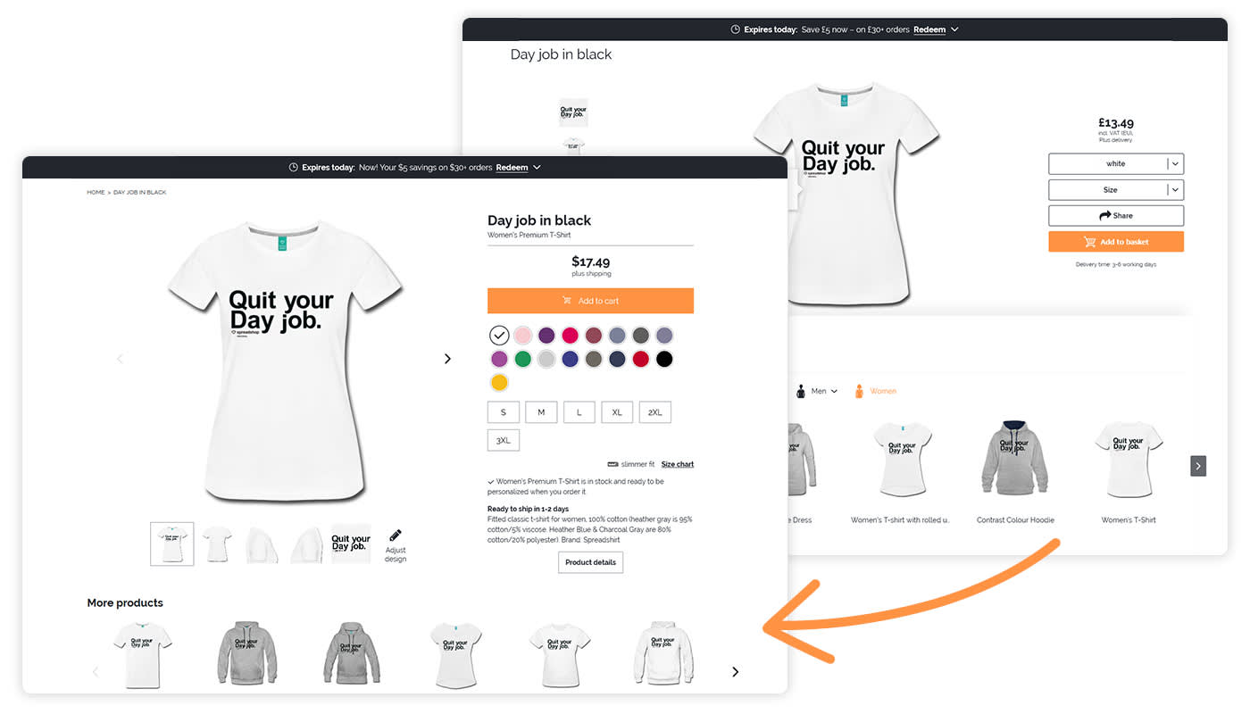
You can now access the beta (test) version of your Shop by replacing the URL element shop with shopbeta in front of .spreadshirt (i.e. shopbeta.spreadshirt.de/SpreadShop).
Please leave any feedback in the comment section below.
Until the end of March, you can try out the beta version of the page. We’re planning to release a revamped Shop in the beginning of April.
Some of the improvements include:
- An alluring new layout
- Improved performance and shorter loading times
- Optimization for mobile users
- A single version of the detail page (instead of the current two-option layout)
- Improved ranking on Google and other search engines thanks to upgraded meta data and schema.org support
- Social media integration with Open Graph protocols

Shop Owner with your own CSS?
We’re defining completely new CSS classes for the new detail page, and they’re already in place in the beta version. Now, you can define separate “HTML & CSS“ styles in the CSS field of your extended Shop settings, both for the current version and the beta version.
These new definitions may not work with your current CSS on the beta version’s detail page. In this case, they will also not work in the upcoming version of the page. This may require you to adjust your layout ideas to the new classes.
Of course, throughout the beta phase, we’ll respond to feedback and suggestions as we continue to improve the system. This means that the beta version may receive another overhaul by the time it goes live.
Shops tied in with JavaScript
Embedding with JavaScript is also possible with the beta version. Just create a new page in your webspace and copy over the embedded code. SImply change the JavaScript code from shop.spreadshirt to shopbeta.spreadshirt so that the beta version is completely embedded.
What’s next?
The new detail page will be released in the beginning of April. What’s more, we’re already tackling the next challenge. We’ll be adding the ability to choose model images and include products’ ekomi ratings in further iterations of this page! Also, keep an eye out for shop collections and cool, new features to easily market your products via Facebook.
Feedback on the detail page will help us help you. Please drop any comments below! Thanks!
I like the updated version a lot better! Nice and clean and to the point.
I also agree that the design detail should be next to the item preview.
I really like the new details page design, is much more user friendly, having the colors and sizes at plain sight is much much better than in a menu. But I have a few suggestions:
1. The text that appears right after the sizes that says something like:
Men’s Premium T-Shirt is in stock and ready to be personalized when you order it.
In my case this shouldn’t be visible because I have the T-shirt Designer disabled in my store. I guess that you could read the value of this option from your database and if it’s enabled show it, and if it’s disabled just hide it.
2. As Scott said in a previous comment, the Design details should be right next to the item preview, even before the More products option.
3. I think that the tags are not important for the customer/store visitor, so I think this probably should be hidden.
And finally I just have one question: the pictures that are right after the size chart, can we customize these or decide if we want to show them? Because like they are right now with no design on it, for us that have the T-shirt Designer disabled, I don’t think they add much to the store.
The market place showroom needs to be reactivated for some reason and is not. All designs previously there are in marketplace but I can’t add more
Honestly my only complaint is that you reject my images.
love designs
There is improvement
I agree with Scott and Ben, otherwise i like the new page.
I would like to see throw pillows 16″x16″I sell many on Amazon.
Need to be able to categorized “group” my products in my shop, it is a basic thing to do for a shop, otherwise everything is all over the place??
Thanks
new to this is everyone having any luck
Love the new changes and improvements!
I like the look of the new detail page, however there are two things that I believe should change:
1. The product description is no longer visible, meaning I have no way of describing anything about the design. This would be great, even if it was more prominent than the old design.
2. The design tags are visible, which probably aren’t necessary for most customers to see how I am categorising my designs.
I like that all of the color options and sizes are displayed upfront (the less clicks involved, the better). My biggest concern is still the fact that the design description, which may be incredibly important to someone’s understanding of the design and their motivation to buy a product with it, is buried at the very bottom of the page as “design details.” I would suggest that be right next to, or directly underneath, the preview image of the product with that design.
Same concern on my side….
I support Scott suggestion, the design description should be right after the preview of the item, even before the More products section.
Looks OK to me.
I need to sell t shirts on my facebook page , I have over 150,000 followers but cant figure out how to make money with it , cant get t shirts on https://www.facebook.com/truthseekers.gnosis/
Very nice! Thank you!!
Approved!!! Thank you