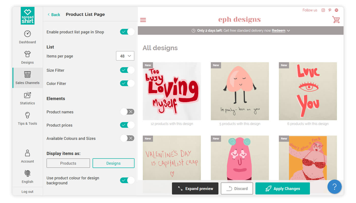
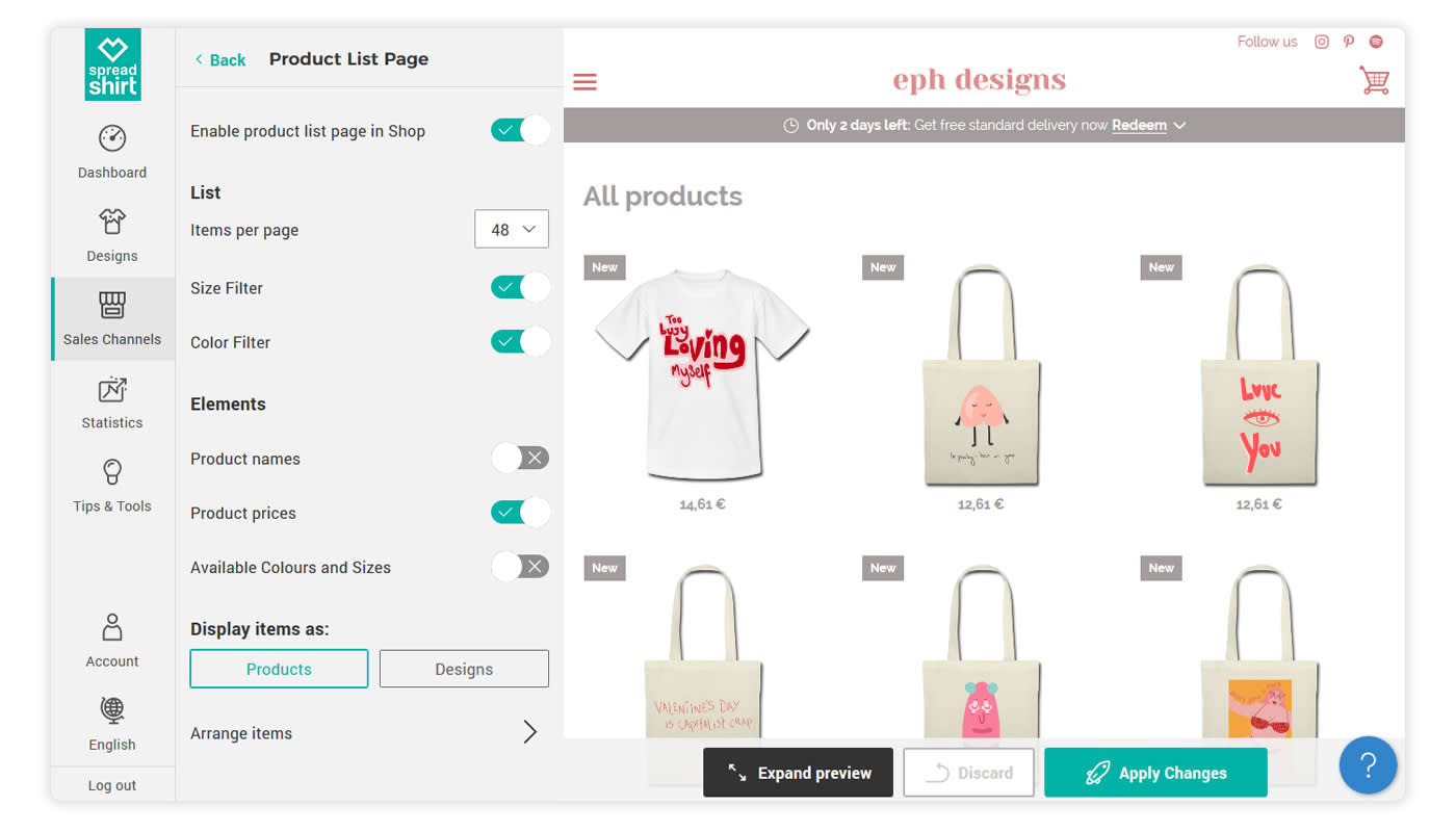
Choosing between the “design overview” or “products display” options can be tricky, and it will depend largely on what you’re looking to accomplish with your Shop.
(This article was updated January 23rd 2019.)
For instance, the “Product List Page” setting (Sales Channels > Edit > Page Settings > Product List Page > Display items as Product/Designs) lets you decide how your products will be displayed to customers. This article sheds some light on the question to help you determine which setting is right for your Shop.
Design Display
This setting is suitable for most Shops and should serve as your default choice. With the ‘Design Display’ option switched on, the customer will immediately see which designs are offered.
If you have many designs on many different products, your customers may need to scroll endlessly in the product view to get to the next design. That means they’ll have to scroll through all the t-shirts, jackets, aprons and hats adorned with the initial design. This could cause a quick bounce from your Shop, as perspective customers may think you only have one design to offer.
Thanks to topics and the sorting function, you can counteract this issue. However, with a heavier number of designs, this can become a tedious task. A better solution in this case is opting for the ‘Design Display’ option. This function allows your customers to see all the offered designs before they select a specific product.

Most importantly, our data shows that Shops that have switched to the ‘Design Display’ convert better than the ones with the product view.
Products Display
This setting is only recommended if you have less than five designs and if you lack design abilities. Therefore, it’s easy to assume that your focus is on the diversity of our product range. This means your customers will immediately see which products are paired with which designs.

This is particularly important when visitors arrive in your Shop without knowing what to expect. Even if your brand is already well-known, the prospective buyer does not necessarily know whether you offer t-shirts, hoodies, pillow cases or some other product.
Activate Your Start Page
Most importantly, you’ll want to activate your start page (Sales Channels > Edit > Page Settings > Start Page > Activate Start Page). Your start page will be your first opportunity to welcome customers to your Shop. It also adheres to the current e-commerce standards, which only helps to add some validity to your Shop.
Hopefully these explanations help clear up the difference between these two options and will help you decide which function works best for your Shop. You can adjust the aesthetics of the page to better match your target audience, and the customization options allow you to add any unique photos or designs. Consider it the “shop window” for your online Shop.
For help with setting up your Spreadshop start page, please visit our FAQs.
The designs in this article are from our talented Shop Owner Eleanor: https://shop.spreadshirt.co.uk/ephshop/
Do you have any experience working with these two options? Do you have anything to add to our guide? Give us a shout in the comments.
Hey, excellent article and yes I’m all for the design overview. Question. Does anyone know how the Goat Shop added the description under the banner?
I prefer the Design Overview. Once a custom clicks on the design, they will be able to see every product I’ve created for that product. In addition, once they click on that product option, they are given the opportunity to see the design on additional products.
Spreadshirt hit a home run with this product layout!
Thanks for the blog post. This should be helpful, especially to newbies.
Jay